01/ Customer
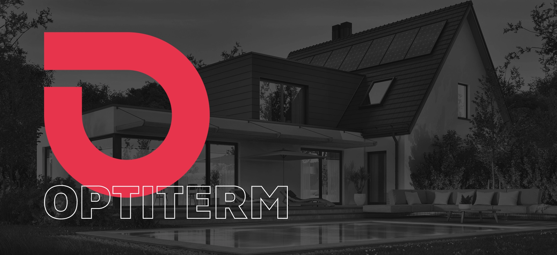
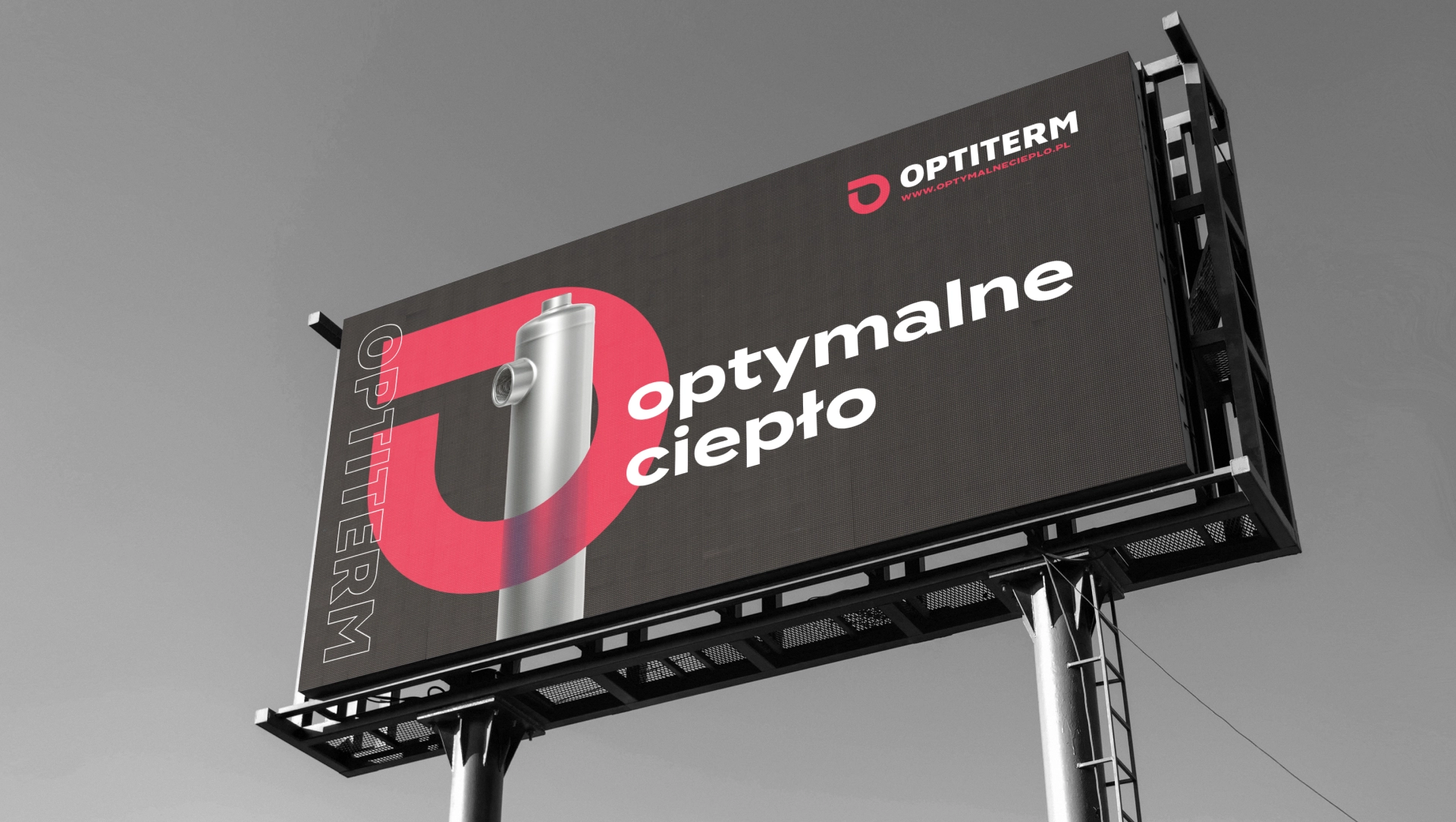
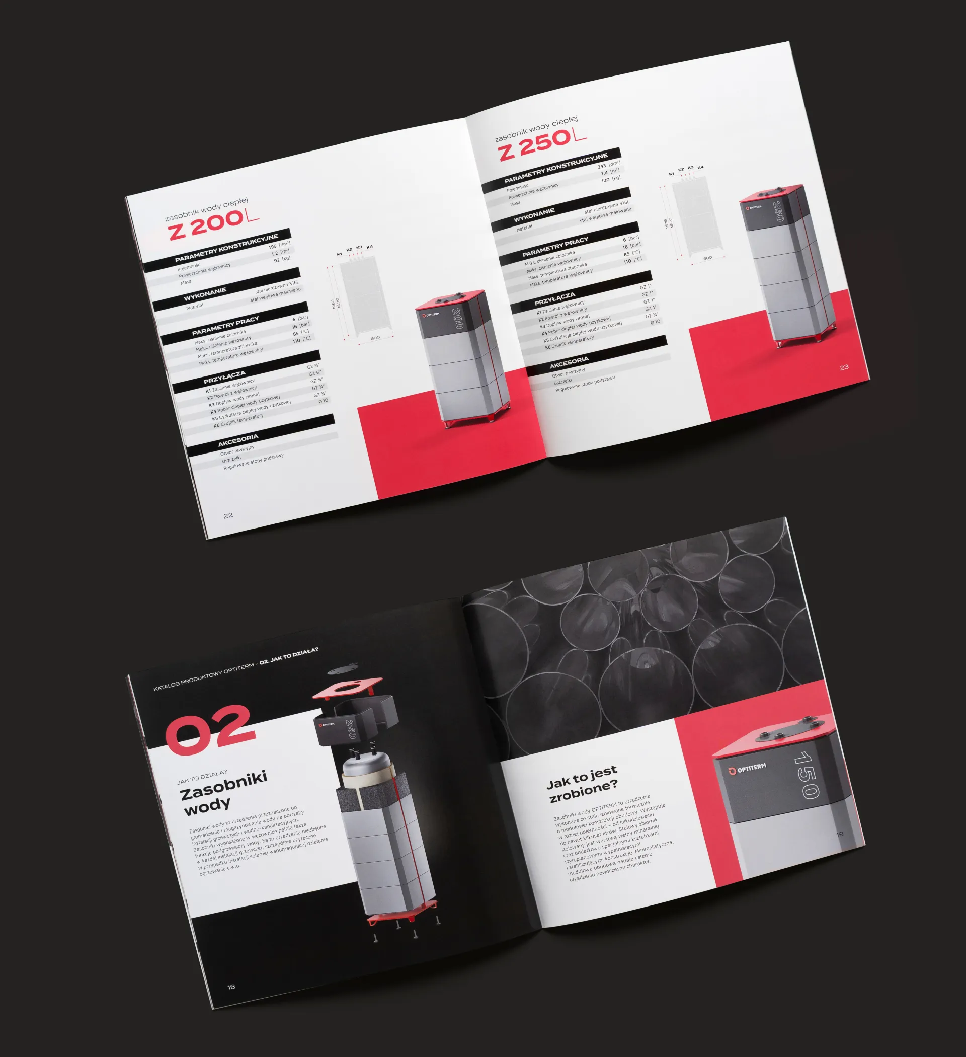
Optiterm is a new product brand created for the needs of the Artpol-therm company, which itself received a rebranding. The offer includes two newly designed product lines: heat exchangers and water tanks.
02/ Scope of work
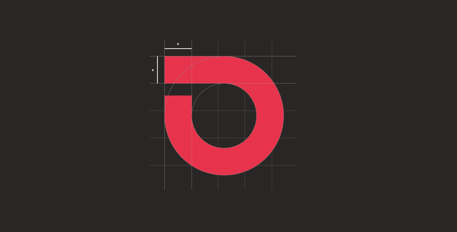
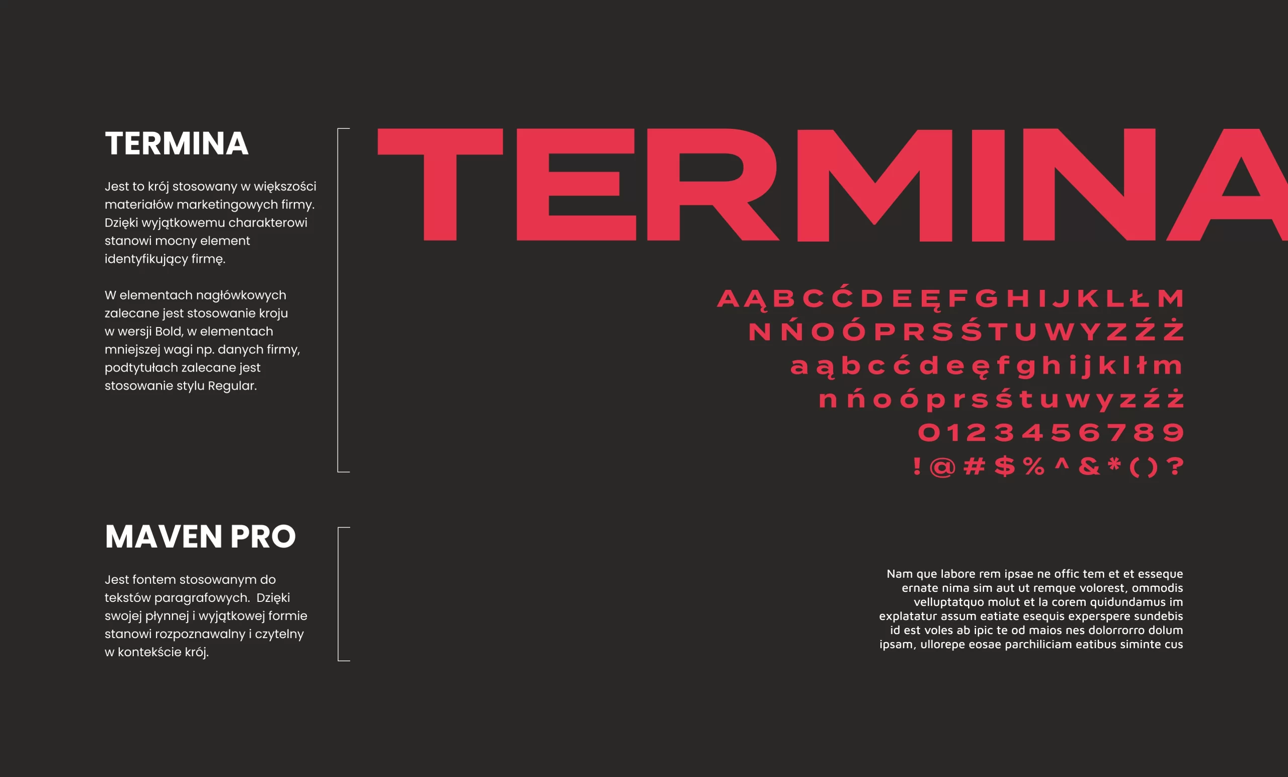
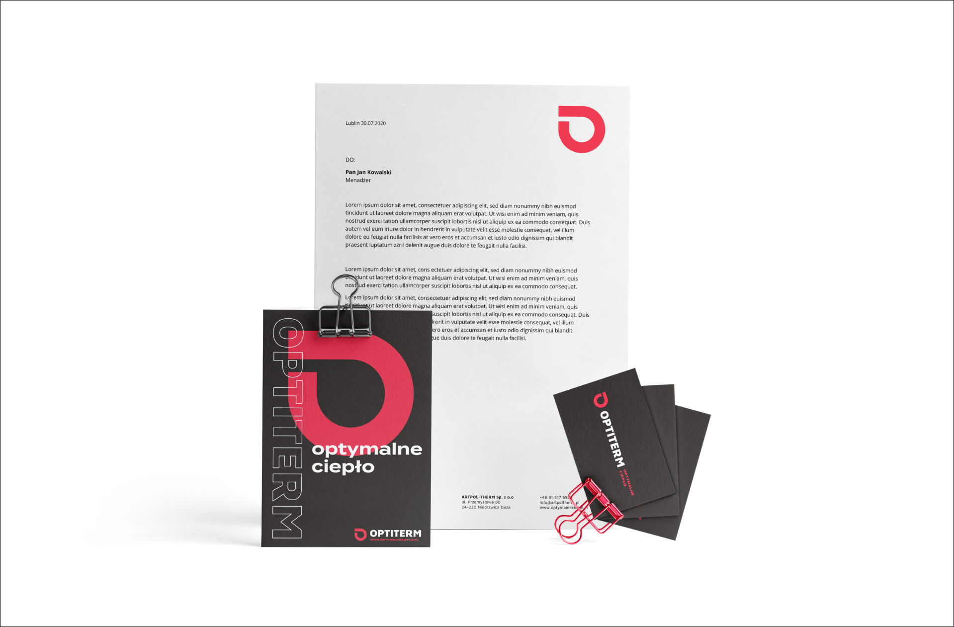
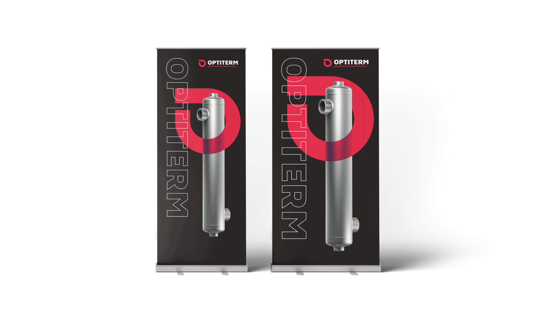
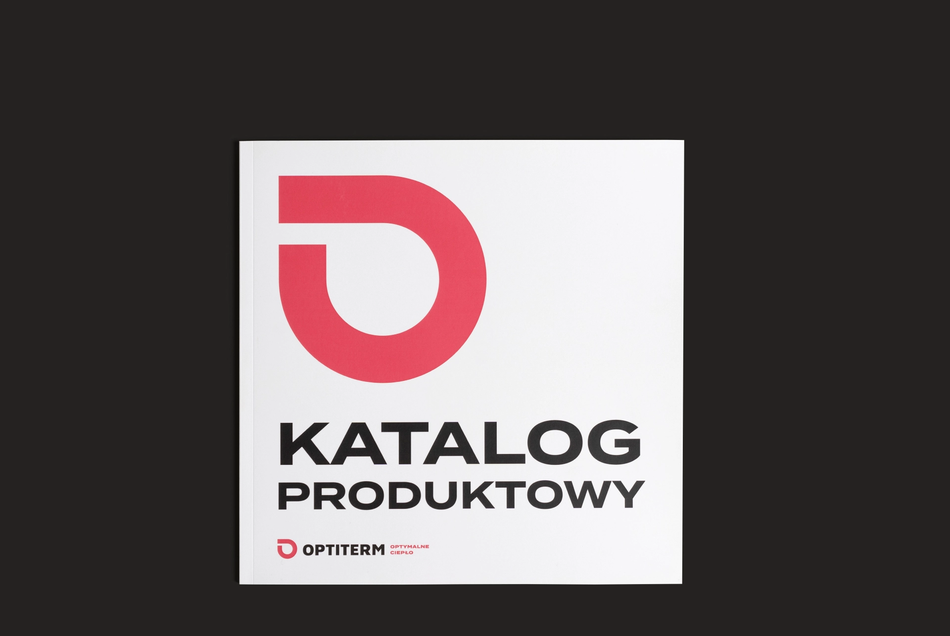
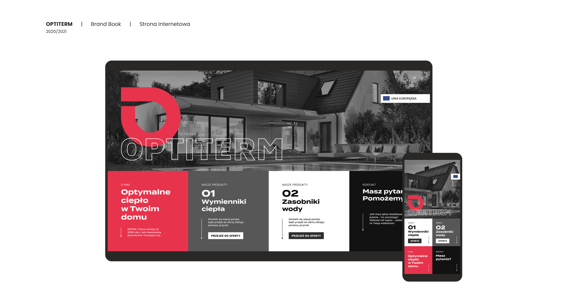
Naming, logo, claim, colours, typography, key visual, sales support materials, promotional materials, exhibition materials, website design and implementation, design of two lines of devices, strategy, product catalogue.
03/ Assumptions
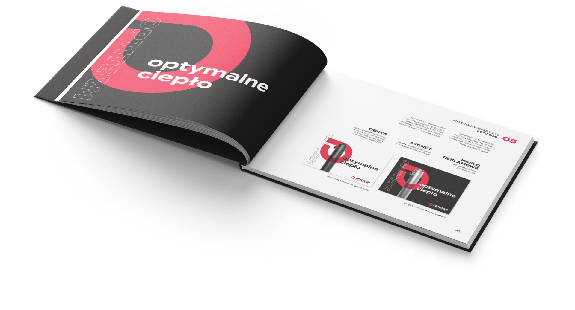
Our objective was to create a brand that through its innovativeness
and boldness will become a recognizable and unique market competitor, while also remaining friendly to existing customers.

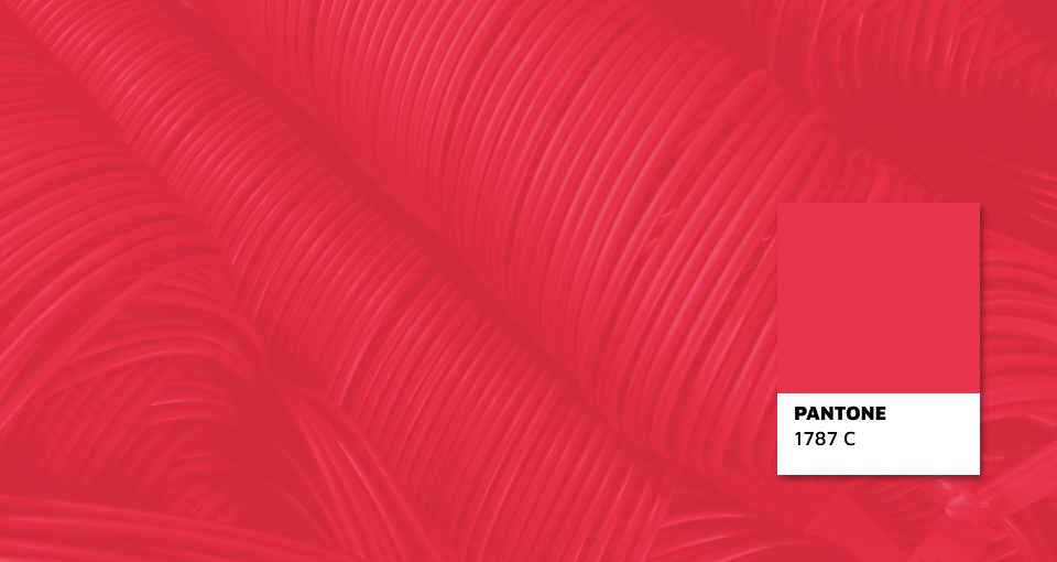
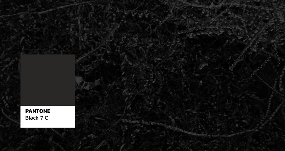
REDNESS
Intense redness represents and emphasizes the most important feature of the company – optimized heat.
CMYK: 0 / 90 / 60 / 0
RGB: 231 / 52 / 76
HEX: #E7344C
RAL: 3018
GRAPHITE
Graphite represents the industrial and technical character of the company.
It is strongly linked with metal – the main construction material of products.
CMYK: 20 / 20 / 20 / 93
RGB: 42 / 40 / 38
HEX: #2A2826
RAL: 9004


2020 / 2021
project management: Radosław Nowakowski
support: Patryk Góźdź
project coordinator: Aneta Biszek
designer: Natalia Konowałek
3D visualizations: Radosław Nowakowski